NSI has been wanting to rebrand their brand and website for a long time since the purpose of their charity has shifted from WW1 only to wider global topics on war and conflicts.
I compiled the list of various organisation and how their logo/branding strategy and draft sketches.
The current logo
Research and looking into the elements they want the logo to be included and my idea
This is my first time making a logo for an organisation and frankly it has been a challenge for me as the elements they want to incorporate were complex ideas but the logo of course has to be simplistic.
Those elements are:
- Creativity
- Youth/children
- Conflicts
And they asked me to combine these elements somehow straight forward yet cleverly intertwined to each other like an optical illusion-ish, which was something I’d never done, even unsure if I could deliver it. But I decided to go with what it comes to my mind.
The draft sketches
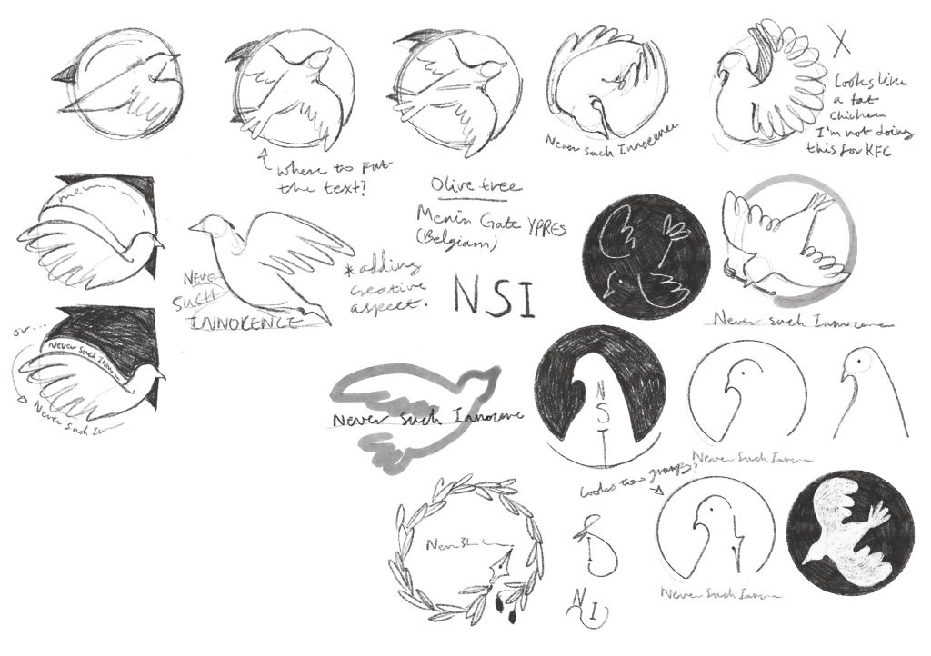
I used the image of dove for being most well-acknowledged symbol of peace and I thought choosing dove would help me depict conflict side as well. When I showed the sketches, the feedbacks were mostly positive but I don’t think there was a design that really nailed down all aspects they wanted.
However, I was told to do more loose drawings like this or hand write their organisation name as they liked the creative authentic value it gives.
Leave a Reply